
Makeup Academy Romantic Efflorescence Palette

The Makeup Academy Romantic Efflorescence is one of their newest palettes, which came out by the end of November last year I think, that is quite perfect for winter. It includes various brown and plum tones that are supposed to create "romantic" wintery looks for a mere £4.00. This is the very first time that I'm so fond of their promotional photograph: just look at this girl! She's pretty much perfect, however I wish they opted for a more berry-toned lip color, then that would certainly capture the winter spirit. I could do not much else than ordering this beauty to find out if it really lives up to my rather high hopes.
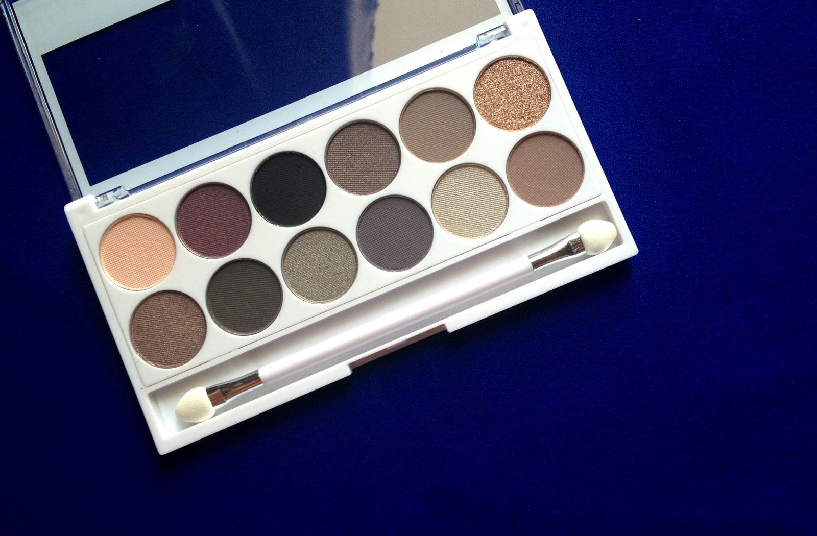
From left to right, top to bottom we have 12 shades in total:
- Mesmeric – A matte peach which I tend to use to blow out the edges of other color to achieve a smoother transition.
- Tempt – A shimmery burgundy purple that looks hella alike Bourjois' Prune Nocturne.
- Corrupt – A matte black.
- Obsessed – A pearl finish mid-brown shade with purple tones.
- Lavish – A matte taupe-brown.
- Fiery – A shimmery/slightly chunkier copper gold.
- Bewitch – A shimmery taupe.
- Magnet – A matte gunmetal gray.
- Exposed – A shimmery gray with every so slightly tint of purple.
- Siren – A matte blue-toned purple.
- Reveal – A light shimmery silver champagne.
- Captivate – A warm mid-toned matte brown.
I like the balance between shimmery and matte shades in this palette, 6-6 to be exact. The palette itself looks pretty and sophisticated with all white quite durable plastic and silver label; also MUA recently comes up with specific names for each shades in their new offerings that makes it much easier to determine which shade is which for people who like to Google swatches and reviews before purchasing something (like me!). However, I must say the pigmentation across the board is rather disappointing: most of them lack pigmentation, powdery, tend to sheer out and create quite a shower of fall out under the eyes except for Fiery (the copper gold). I couldn't bring myself to swatch them on my arm since I found it best to use a small brush to pack and build up pigmentation rather than swiping the shades in. I feel like they added a little too much filler to the powder rather than pigment unlike their Undressed and Heaven And Earth palettes (my personal neutral-toned favourite palettes from MUA). The shade I had the highest hope for was Tempt – which looks exciting in the pan – lacks majorly in the pigmentation department.
If you prefer your eyeshadows to be in the softer, less pronounced side then these colours are great for you since they blend quite nicely; but if you're like me that want them to pop, then a base is a must. I used Too Faced Eyeshadow Insurance first, then a light layer of Maybelline Color Tattoo in Bad To The Bronze as a base before applying these colors. The end result was pleasing, but not enough for me to praise for this particular palette. If you're after plums, purples and golds then a rather affordable yet excellent alternative is the Sleek i-Divine Vintage Romance.


0 comments:
Post a Comment